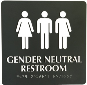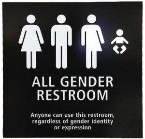
If one needs to go to the Restroom at San Diego’s LGBT Center or at the San Diego Airport, one may find oneself presented with an all gender identities public restroom sign.
The LGBT Center’s public restroom sign has the Americans with Disabilities Act (ADA) international symbol for males, the ADA international symbol for females and a third gender symbol with the left side male and the right side female. Beneath that row of three symbols is raised text and Braille which says “GENDER NEUTRAL RESTROOM.” The restroom facilities there are multi-stall.
The San Diego Airport public restroom signs have the same three symbols used for The LGBT Center’s public restroom signs, plus a third symbol for an infant. Beneath that row of four symbols is raised text and Braille which says “ALL GENDER RESTROOM.” Then in additional text below the braille letters, the sign states “Anyone can use this restroom regardless of gender identity or expression.” The restroom facilities that have these signs are all single stall.
My publisher, Stampp Corbin, in his message this week applauds this development at the airport but questions the meaning of the third adult pictogram. And rightly so.
Many transgender people prefer gender neutral public restrooms. For many early in transition, or with genderqueer or gender nonconforming appearance, it’s because choosing a designated male or female bathroom is often a choice between getting yelled at or getting beat up. In the past, the Transgender Law Center had a publication on their Web site entitled Peeing in Peace. That publication advocated gender neutral/all gender/unisex restrooms for trans people.
Restrooms need signs, and the ADA has minimum requirements for public restroom signs. These requirements are:
• Gender pictogram(s) to show gender use of the bathroom.
• The International Symbol for Accessibility (ISI) pictogram to show whether there are or aren’t facilities for people in wheelchairs.
• Tactile letters showing who the room is for. That can include WOMEN, MEN, or UNISEX, or can just state BATHROOM or RESTROOM.

• A 70 percent (“high”) color contrast between the color of the sign and the text.
• Grade 2 Braille translation of the word or words on the sign.
These signs are placed on the side of public restroom doors so that the blind can read the gender use of the bathrooms without the door opening up on them as they are reading who the bathroom is for.
California has separate requirements for public restroom doors, so a second California compliant restroom sign is required to be placed on the public restroom door itself, and has tactile symbols. The California requirements for those symbols are:
• Men’s restrooms are identified by a 1/4 inch thick equilateral triangle with 12 inch long edges and the vertex pointing up. The color of the symbol must contrast with that of the door.
• Women’s restrooms are identified by a 1/4 inch thick circle with a 12 inch diameter. The color of the symbol must contrast with that of the door.
• Unisex restrooms are identified by the 12 inch circle with the designated 12 inch triangle superimposed on it. The color of the triangle must contrast with that of the circle which must contrast with the color of the door.
For California signs, there is no requirement for pictograms or text, although there can be.
So for the ADA required signs for the sides of public restroom doors, one can see why a business or nonprofit which wishes to advertise their inclusivity would want to come up with a separate transgender pictogram. I’d argue against going that route.

Trans community member discomfort often comes with that third gender pictogram of a half-man/half-woman. I’ve talked to a number of trans people over the years who look at that half-man/half-woman pictogram and see it at best as third gendering or at worst saying “she-male” – she-m*** pretty much being the worst pejorative that one can call a trans person.
Perhaps the best way to show inclusivity isn’t to include the half-man/half-woman pictogram on the ADA compliant sign. Trans positive language of “ALL GENDER RESTROOM” or “GENDER NEUTRAL RESTROOM” with just the standard male, female and disability pictograms would certainly be welcomed without the half-man/half-woman pictogram.
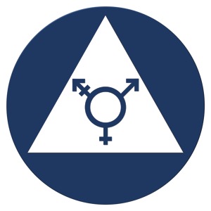
Perhaps the best way to show inclusivity could better be accomplished within the California required tactile sign on the public restroom door. For example, the online store adasigndepot.com has a sign with the California unisex sign in blue and white with a blue transgender symbol in the center of a white triangle.
All the messaging of inclusivity with a symbol without the third-gendering of an awkward pictogram. It’s a thought.


I guess a try it and see what works best can help decide. I imagine it would be less expensive if just one type of restroom is made genderless.
But… What about 3rd gender/genderqueer people who aren’t covered by the usual two symbols? I definitely read the inclusion of the ‘mixed’ symbol as referring to them rather than binary trans folk.
I don’t see where the transgender logo is any different from the airport sign. They both have something that indicates two genders combined. To me, they would be equally offensive.
It does not matter how you address them, they will always be offended.
if there is no wheelchair icon, the bathroom isn’t universally accessible. Period! i hope in our call for gender neutral bathrooms we include the demand that they provide access to our gender binary busting siblings who use wheelchairs.
It’s simple if GOD made you a man use the men’s bathroom if he made you a woman use the weman’s bathroom if you let some stupid doctor destroy your body go behind a bush and hope nobody sees you you’re just messed up in the head
The sign that includes the half-man/half-woman graphic is meant to be all inclusive, including people who are gender-fluid, genderqueer, or any other designation that is not binary or that fluctuates. If a trans person either identifies male or female, then why can’t he or she identify with the appropriate pictogram (the man or the woman) and assume the third pictogram is for people who identify differently than them.
Does anyone take offense to the baby pictogram and take it that it implies an association with the ABDL community?
If people spent half the time looking for a cure for cancer as they do inventing new gender-speak, and creating gender studies out of whole cloth, well, yeah. The selfishness of this “movement” knows no bounds.
New York had unisex bathrooms when i was there in 2005
Well, it is the most intellectually messed up city in our nation, besides Hollywood.
We need an international sign that means ‘Bathroom’ period.
Like WC for water closet in Europe..it’s interesting to me that when we attend outdoor events and all have to use Porta Pottys this issue is moot.
This is freaking amazing!!! All this talk about a sign to piss…. this country is so F–;:&@ed up its amazing!!! People head out of butt, your going to the bathroom
Oh, goodie! Because I identify as an infant!
Ditto those who point out that the third figure includes those who identify as non-binary, genderqueer, etc. The first two figures are indicative of a gender binary that is not inclusive.
I find it offensive that the baby is sexless. Thats ok if thats how the baby feels but what if the baby identifies as a male, female, or some where else on the spectrum. And what if the baby identifies as an adult? Or something plant based? You need a lot more symbols. I would sugest Changing the symbol back to a moon that was used on outhouses but that would offend the sun.